Discover how we took ProVita's vision for a distinctive logo and transformed it into a symbol of professional excellence. Explore the challenge, our creative solution, and the impressive results achieved through this collaborative logo design process.


Challenge
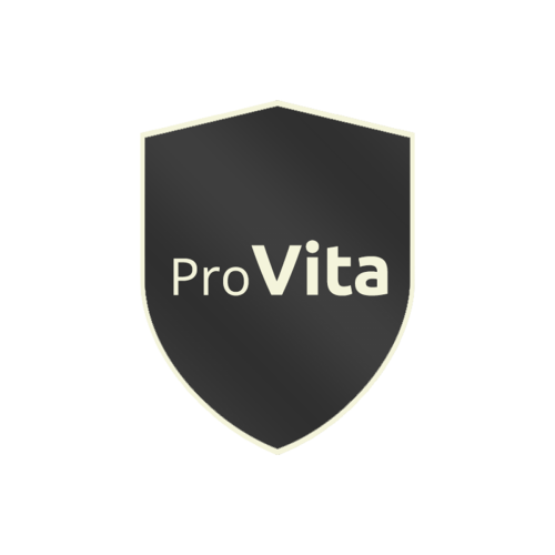
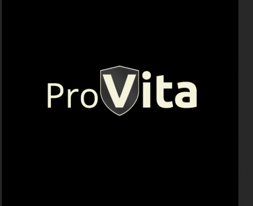
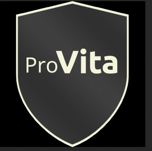
ProVita, a pool safety inspection business, approached us with the challenge of creating a simple yet impactful logo. They envisioned a design that prominently featured a shield, incorporated the words "pro" and "vita," and utilised a colour scheme of greys and beige.
Solution
Our team went to work, presenting several logo concepts to Eddie, the owner of ProVita. The final design encapsulates a sense of shining professionalism. A shield with a silver-to-dark grey gradient is outlined in beige to match the font colour. The word "Pro" is rendered in a neat and clean "Open Sans Regular" font, while "Vita," meaning "life" in Latin, is brought to life with the bold, vibrant font "Ubuntu." A clever touch was added as the "T" in Ubuntu resembles a wrench, symbolising the use of tools in maintaining life.
Results
The transformation was remarkable. The new logo embodied professionalism and conveyed the core message of ProVita's services. With its balanced colour palette and visually engaging elements, the logo served as an effective representation of the business. This project showcases our ability to translate concepts into captivating visual identities that leave a lasting impression.
0.09% CTR
20% less CPA
272% ROI
From The Client
"These guys have built such a strong relationship with our organization that we consider them an extension of our IT department. We always know that excellent service is just a phone call or e-mail away and that we will receive the same level of attention they always provide that makes us feel like we're their top priority."


